
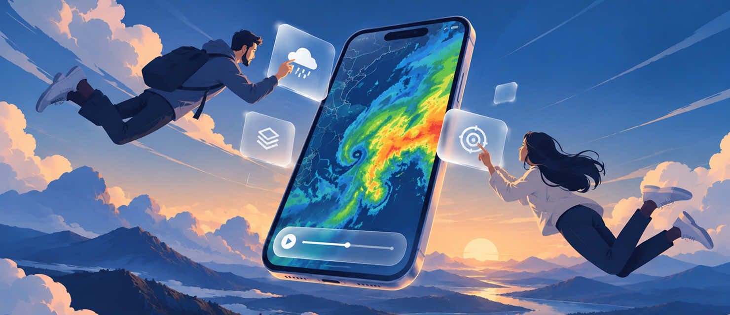
RainViewer 8.0 clears the map screen, on iOS and Android. The name of the active layer is written on the map, the player shows one time, playback options now live behind one button, and a new fullscreen mode gives the whole screen to the radar. iOS 26 wraps this in Apple’s Liquid Glass; Android gets it in Material 3.
A map built to read on the go
Most people check RainViewer while they’re out and about, heading out the door, glancing at a phone mid-errand, deciding whether to grab an umbrella. The map needed to be read at a glance, on both platforms, before either platform’s own design language could sit on top of it cleanly.
The layer name is now written on the map. Previously, the layer button displayed an icon that proved difficult to distinguish across different layers. Now, on both iOS and Android, users see text labels: Radar, Satellite, Radar and Satellite, Satellite Plus, Forecast 72h, Temperature, or Rainfall Totals (QPE).
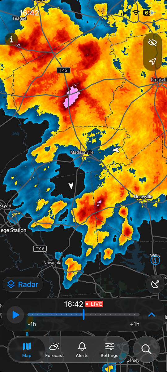
One time on the player. The updated player displays a single time value instead of multiple technical readings, on both platforms. The LIVE badge indicates current data. Animation speed controls alongside interval options have moved under a single button.
Fullscreen mode instead of in-app sharing. RainViewer had its own sharing feature for years, built for a time when a phone couldn’t easily capture a screen animation on its own. That’s changed, every phone now records the screen, edits the clip, and sends it anywhere in a few taps. An eye button activates fullscreen mode on both iOS and Android, displaying only the map and a minimized player.
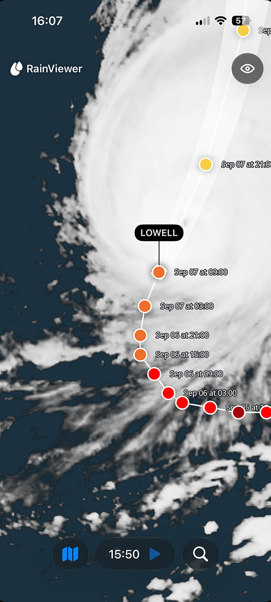
Fewer buttons on the map. The share and favorites buttons were removed from the map itself, on both platforms. The list of favorites is still accessible from the Weather tab and share can now be done with fullscreen mode and your smartphone’s standard tools.
Unique to iOS
Apple presented Liquid Glass more than a year ago, but RainViewer didn’t rush to adopt it. People open a weather radar several times a day, and a change of look should feel like a smooth step instead of their routine disruption.
Glass is demanding. It floats over content and lets it show through, so it only looks right when there’s little content underneath. To make glass work, the screen had to get simple first. That’s how a design update became a product update.
Liquid Glass, start to finish. iOS 26 implements Liquid Glass throughout the interface: the player, the tab bar, and fullscreen mode are all glass. iOS 18 keeps its established look while including every functional improvement above.
iPad gets its own layout. Content is centered for the larger display, navigation fits the device, and the map stays correct at any window size.
An honest timeline. On long ranges, frame markers used to sit so close together that they merged into a solid line, allowing for no way to tell a real gap in radar coverage from a limit of the drawing. Marker density now adapts based on range, with smaller regular markers and taller hour-markers on extended timelines.
Search moved to the tab bar — bottom on iOS 26, top on iOS 18 — and still searches any location, centering the map the way it always has.
The Apple Watch radar complications and 12–24 hour forecasts are rebuilt providing for easier reading.
Unique to Android
Android’s tab bar moves to Material 3 introducing new icons with a lighter change than iOS’s glass overhaul; navigation itself works the way it always has.
A new landscape layout, built specifically for 8.0. Tablets and foldables as well as larger screens are even better supported with this release.
Frame markers on the timeline. iOS has had them for a while; this is Android’s first release with them, on by default with a setting to turn them off. The adaptive marker-density behavior described above for iOS isn’t part of this Android release yet.
Search is new on the map, with one difference from iOS. For now, it opens one of your saved places rather than searching any location and centering the map on it. Full location search on Android is on the way.
Everything else still shines
The redesign touched the frame around the radar, not the radar itself. Everything you use every day is in place:
- Tap on the map to see precipitation details at that point.
- Hurricane and storm tracking with tracks and forecast cones.
- Precipitation arrows that show where the rain is moving.
- The Forecast screen that takes you through the day, hour by hour.
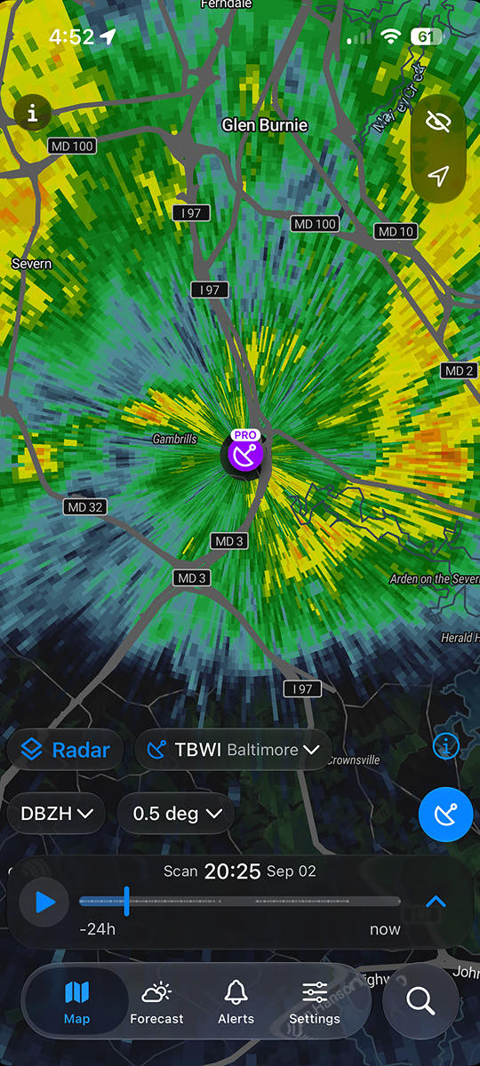
- Pro Radar with raw station data, tilt angles, and dual-polarization products.
- Rainfall Totals (QPE) that shows how much rain has actually fallen.
Everything about the rain, we still compute ourselves: the radar composite from hundreds of stations, the nowcast, the arrows, the totals. That is our advantage, and it is why the map can be this simple on top.
Tell us what you think
Update RainViewer to 8.0 on iOS and Android and open the map to see the changes. If something feels off, or something you relied on is missing, write to us. This release is built on what people told us, and the next one will be too.

 RainViewer
