
A Met Office weather warning colour isn’t a simple severity scale where amber is worse than yellow and red is worse than amber in a straight line. It’s the output of a matrix that combines two separate factors: how likely the event is to happen, and how severe the impact would be if it does. Understanding that matrix explains warnings that otherwise seem inconsistent.
Two questions, not one
Every warning starts with the same two questions. First, how likely is this weather event to actually occur as forecast. Second, if it does occur, how significant would the impact be on daily life, transport, and safety. A yellow warning can mean either a fairly likely event with low impact, or a genuinely severe event that’s less certain to actually happen. Both land in the same colour, for different reasons.
The Met Office assigns warning colours using a matrix of likelihood and impact severity, not a single escalating scale, which means two yellow warnings can represent very different underlying situations.
This is why reading only the colour, without the accompanying text describing what specifically is expected, misses real information. A yellow warning for heavy snow in an area unused to snow can carry more genuine disruption risk than an amber warning for wind in a region well-prepared for it.
What each colour actually signals
Yellow means: be aware. Conditions could affect daily routines, travel, or outdoor plans, but the situation generally remains manageable with normal caution. Amber means: be prepared. There’s an increased likelihood of impacts significant enough to affect travel plans, cause disruption to power or water supplies, or pose some risk to safety. Red is reserved for the most serious situations: dangerous weather that’s very likely to happen, with impacts severe enough to pose a genuine risk to life, and it usually comes with explicit advice to avoid travel in the affected area entirely.
Red warnings are deliberately rare, precisely because reserving the highest colour for genuinely exceptional situations is what keeps it meaningful when it does appear.
Why the same weather can produce different colours in neighboring regions
Impact severity isn’t judged purely on the weather itself. It also accounts for how prepared a region typically is for that specific type of event. Heavy snowfall in the Scottish Highlands, where infrastructure and driving habits are built around winter conditions, might warrant a lower warning colour than the same snowfall in a part of southern England unused to it, where the same snow depth would cause far more disruption to transport and daily life. This regional calibration is deliberate, since a warning system’s purpose is communicating genuine disruption risk, not simply describing the weather in isolation from how a place actually copes with it.
This is part of why comparing warning colours across different regions of the UK on the same day can be misleading if taken at face value, without accounting for how differently prepared each region is for the same conditions.
Why a warning for one area doesn’t mean another is fine
Weather warnings in the UK are issued for specific regions, and Scotland in particular often sees warnings that differ meaningfully from those covering England on the same day, reflecting genuinely different weather systems affecting different parts of the country simultaneously. A red warning for one region and no warning at all for a neighboring one isn’t inconsistency. It’s the system working correctly, describing different actual conditions in different places.
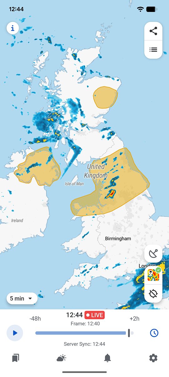
RainViewer displays official Met Office warning colours as live overlays on the radar map, showing the exact warned boundary against a saved location rather than a single national headline.
See the warned area, not just the colour
A warning colour on a news headline describes a region, not a specific address. The practical question for anyone checking a warning is whether their own location actually falls inside the warned boundary, and how that boundary relates to the storm producing it.
RainViewer shows Met Office warning colours directly on the radar map as a live overlay, making it possible to see exactly which areas fall inside a yellow, amber, or red warning relative to a saved location.


 RainViewer
